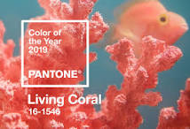
Each year, the Pantone Color Institute announces a Color of the Year. For 2019, that color is coral. Here in South Florida, we find the color coral used frequently, especially in the oceanfront condos of Boca Raton and Delray Beach that beckon design towards colors that remind us of the sea. Coral is lively, warm, and inviting. It is fresh and feminine without being too “girly.”
Whether you reside in the suburbs of Coral Springs and Parkland, or along the waterfront of Deerfield Beach or Fort Lauderdale, using the coral color in any of its hues can brighten up your home.
One thing we often find when looking at coral on the color wheel is its use with varying shades of blue. Coral and turquoise or aqua are perfect for an ocean or beach-themed interior design. You do have to be careful when choosing the shades to blend into your room. If you are using a vibrant shade of coral, then you want an equally vibrant blue. An example of this is seen when combining it with tiffany blue and white.
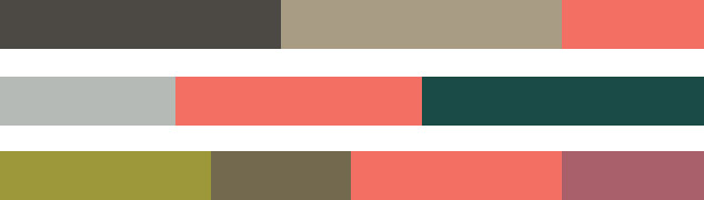
Muted shades of coral work best when used with complementing muted colors. Creating a neutral environment with coral pairs it well with shades of cream, beige, gray, and tan, and it also combines well with warmer colors such as yellow, apricot, and peach. Accent pillows, rugs, curtains, ceramics, or lampshades that feature coral help to energize a neutral room.
Living Coral Palettes to Consider for Interior Design
What color is coral considered? Depending on the shade and hue, it may appear as the color salmon, coral pink, or peach color. The Pantone Color of the Year 2019 is Living Coral. It is a vibrant shade that thrives as an accent to other colors in a room. Living coral reminds us of the coral that is alive under the ocean surface, giving shelter and nourishment to all forms of sea life.
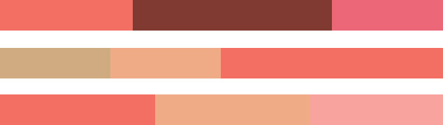
Pantone has created five color palettes that feature living coral. In the first, Focal Point, coral becomes the focus of the cool color grouping as it pairs with colors such as Storm Gray, Forest Biome, and Martini Olive. Other shades in this grouping include Golden Lime, Beluga, Twill, and Mauvewood.
For those who love the vibrancy of a dazzling sunset, Pantone brings Shimmering Sunset to life with colors such as Conch Shell, Hot Pink, Aurora Pink, and Magenta Haze to blend with Living Coral. Radiant Yellow, Amberglow, and Papaya add the warmth of sunrise to your room.
The next palette is Sympatico, designed to pay homage to the world’s many skin tones. These beautiful colors create a warm glow in your home. Living Coral compliments Burnt Henna, Rose Dawn, and Coral Sands, combining two shades of coral into one beautiful palette. Sun Kissed Coral, Candlelight Peach, Sand, and Mellow Buff also work beautifully to create an inviting habitat.
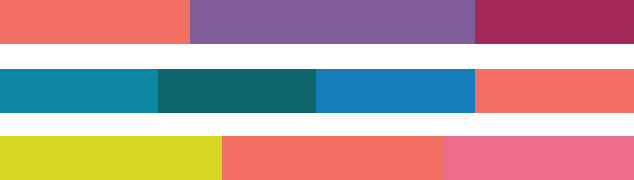
If you are looking for a fun and energetic design using Living Coral, look no further than the palette called Trippy. With a nod towards the hallucinogenic 60s, Trippy combines it with exuberant shades such as Sulphur Spring, Chive Blossom, and Vivacious. For those looking for a bit more blue in the room, Barrier Reef, Deep Lake, and Ibiza Blue mesh beautifully with Coral and Pink Lemonade.
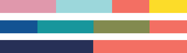
In our final palette, we go Under The Sea, to embrace the lure of the ocean and the ecosystem of the coral reefs. Here, Living Coral mingles with shades such as Blue Depths, Turkish Sea, Viridian Green, and Turtle Green. For an even brighter feel in the room, mix it with Sea Pink, Vibrant Yellow, and Limpet Shell.
How to Use Coral In Your Home
There are so many ways to use coral without it seeming overwhelming, and it makes an excellent accent wall, especially in a dining room or kitchen as it can help improve digestion. As a wall color, coral serves as a background for framed nautical or nature pictures, neutral tapestries, and your favorite photos. Bright lights can enhance the vibrancy of coral walls while soft lighting can help tone down the color.
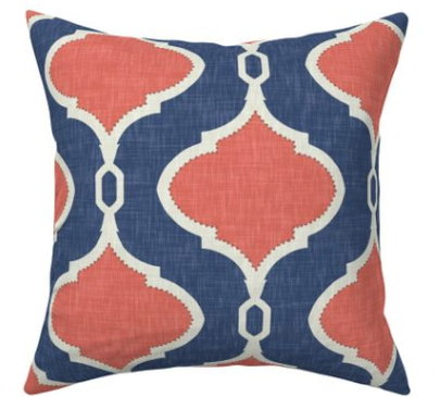
Of course, coral works wonderfully as an accent in your room when used in a rug or on throw pillows. A coral pillow on a neutral couch provides a visual pop of color. For something more downplayed, you can choose pillows with just a hint of coral.
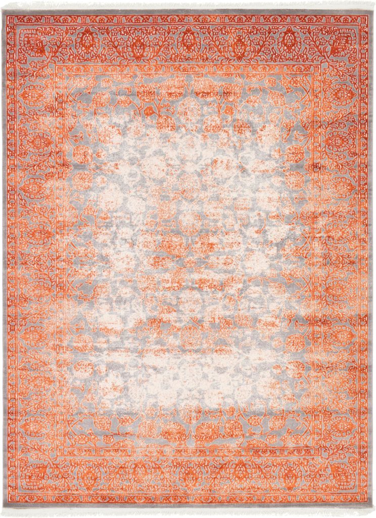
A small accent table in the corner of a room or against a wall is another great way to bring the color coral into the room. You can choose a strategically placed chair, curtains, or even a chandelier to help liven up a neutral palette. As you can see in the rug below, coral pairs beautifully with the color gray.
South Florida residents can learn more about incorporating coral into their homes by contacting HK Interiors. Call us today at 954-401-8542 to discover how our interior design services can help you transform your home or office into the vision you desire.