Color Theory: The Psychology of Colors in Interior Design (Part 2 – the Secondary & Tertiary Colors)
In our previous blog about basic color theory, we discussed the primary colors of red, blue, and yellow. Next, we will examine the impact of the secondary and tertiary colors.
What are the secondary colors?
When you combine two primary colors, you wind up with a secondary color. Red and blue equal purple. Red and yellow make orange. Yellow and blue turn into green.
What are the tertiary colors?
By mixing primary and secondary colors, you wind up with the following six tertiary colors:
- Red-orange
- Yellow-orange
- Yellow-green
- Blue-green
- Blue-violet
- Red-violet
Of course, the art of color theory does not stop there. By varying the amount of one color in the combination, you can wind up with an endless array of shades. Just walk into any paint shop, and the swatches are astounding. How will you ever decide?
That is where the help of an experienced interior designer is invaluable. The use of color in design is an art. There is also a science behind it – often termed room color psychology. As an interior designer, it is my role to help select the precise shades for your room. We can incorporate color schemes into your walls, window coverings, furnishings, flooring, or accent pieces.
Incorporating Secondary and Tertiary Color Theory into Your Home
When we delve into the psychology of colors in interior design, we often find ways to address specific issues a person may have. For example, the right colors can help if you have a lot of stress in your life. We will want to add cooler, calming colors, such as varying shades of purple, blue, and green into your home.
The color theory wheel also helps you pick complimentary colors – but we will save that conversation for another time.
Now let us examine the color theory behind the three secondary colors. The tertiary colors will be variations of the impacts you read about below:
Purple – Often associated with royalty, purple brings with it a feeling of power. When tinged with more of a blue undertone, purple can add calm and serenity to your space. Purple shades that have a bit more red increase attention and are more dominating. You can also use purple to stimulate creativity.
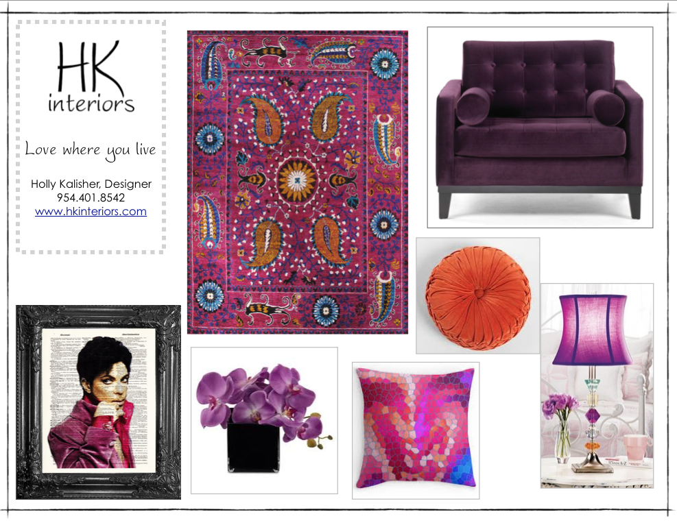
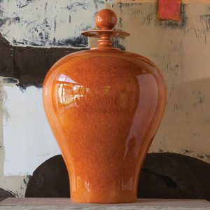
Orange – When looking for a touch of warmth, consider a vibrant shade of orange. The kitchen and dining room are two areas of your home that can benefit from orange as it stimulates appetite and may help improve digestion
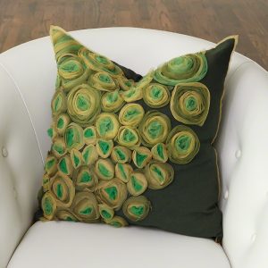
Green – It is natural to think about nature when using the color green. This is a wonderful way to incorporate the outdoors into your home. Green is associated with balance, harmony, energy, and stability.
Using Color Theory to Go Beyond the Primary and Secondary Colors
The world would be a boring place if we stopped at the primary, secondary, and tertiary colors. There is still so much more to experience – and to bring into the home. We can continue to use color theory to add other hues into our interior designs, such as:
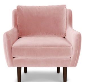
Pink – It is not surprising that pink is often found in the rooms of little girls. Pink has a fresh sweetness that is soothing to the eye.
Gray – Elegant yet conservative, beware of yellow tints that can impart a depressing feel. Gray brings a refreshing appearance, especially when combined with white, black, and a hint of color. Using silver shades will spice gray up and bring a feeling of wealth and prosperity. Gray is a great neutral color.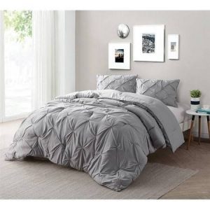
Black – If you are looking for a bold, powerful, and elegant look, search no further than black. Just be careful not to overdo black in your home.
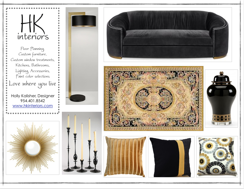
Brown – Also associated with nature, brown is a neutral color that adds stability and security to your space. The richness of wood is symbolic of good taste and is often used in offices
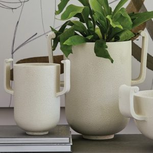
White – Clean, crisp, refreshing – perhaps the most neutral of all “colors.” White is quiet, airy, pure – devoid of color, and lends itself to any accents. You can also achieve a formal look by using cooler shades and textures of white. Warmer hues bring a cozy feel to the room.
You can also refer back to Part 1 of this series on color theory to read up on the primary colors.
Please contact HK Interiors to discover how our interior design services can help you create magic in your home or office. Call 954-401-8542 today for all your interior design needs.